Turning scattered data into clear, actionable insights, empowering claims teams and analysts to respond faster and smarter.
Role
Sole UX and UI Designer
INDUSTRY
Insurance
Company
MS Amlin

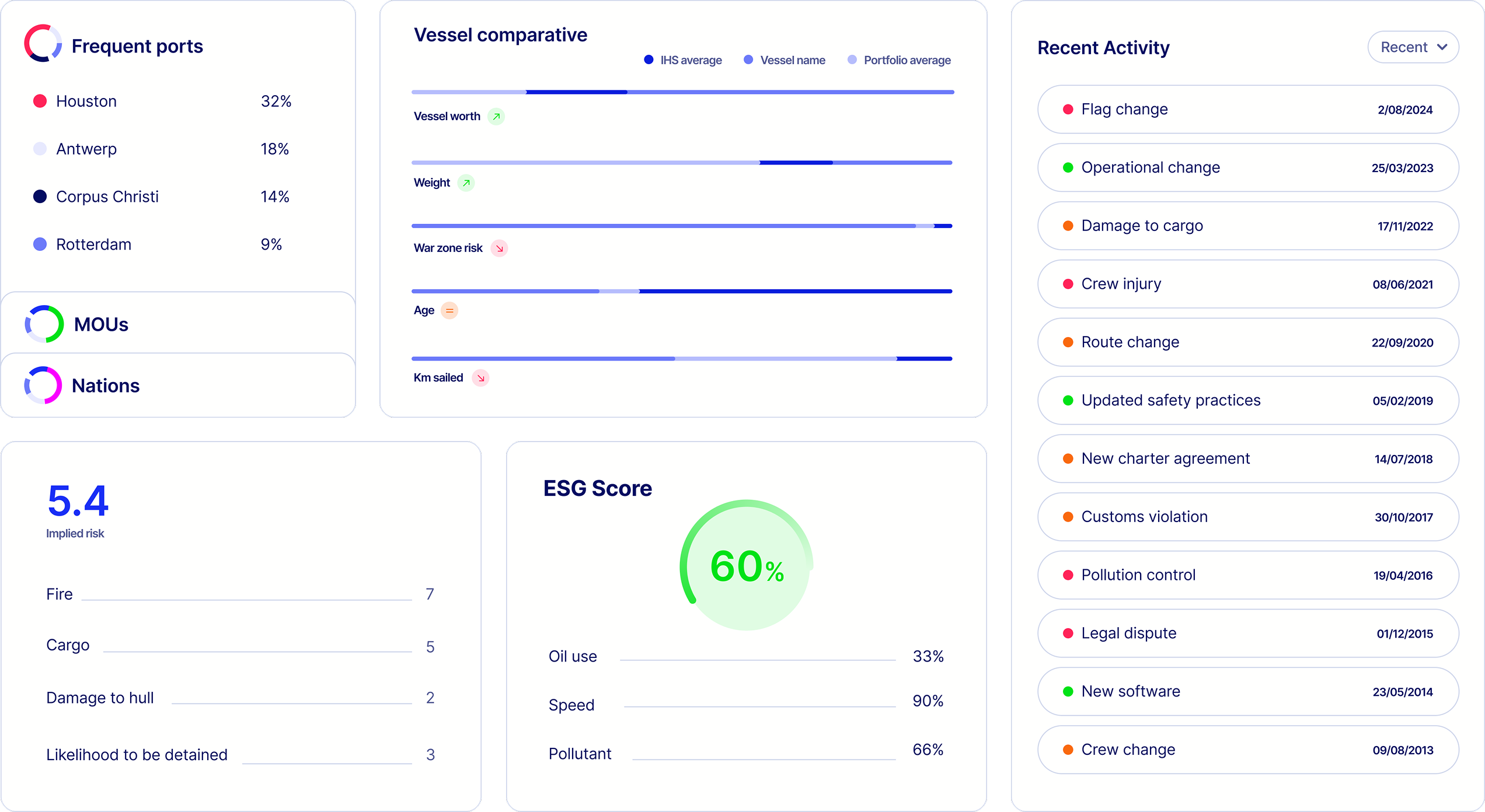
When a major catastrophe occurs, such as an earthquake or hurricane, insurance
claims teams and portfolio analysts struggle to quantify the financial impact. The challenge is
even greater in specialist insurance, where a single policy can cover multiple properties rather
than individual assets.
Currently, insured properties are stored in tables in
spreadsheets and policy administration systems, making it difficult to analyse the exposure of
insured assets in recently impacted areas. While live geographic hazard data is made available
by local governments, such as wildfire zones in California or flood and earthquake risk maps
from Japan, this data was not being leveraged effectively within the business.
The development and data science team had already began an effort to create a tool that could capture catastrophe-affected policies. While the tool met the user's basic needs, there had not been a design approach to creating the tool, making it hard to navigate intuitively, inconsistent in it's design and lacking a purposeful user journey to help users achieve their goals.


I began by speaking to the stakeholders to find out exactly what they needed
their teams to achieve by using the tool. I was able to gauge the following:
There was no
easy way for insurers to assess the financial impact of large-scale disasters on insured
properties. Analysts relied on manual processes and disjointed data sources, making the rapid
decision-making required in these scenarios near impossible.
Affected users

Improve efficiency in claims handling and exposure analysis.
Access to an interactive way to visualise insured properties and risk areas.
Having thoroughly defined the goals of the business, I sent out a spreadsheet for existing users to document their requests for a design refresh and record recurring issues. Designing for Japanese users requires a different approach to designing for Western users and illuminated some extra considerations.
Japanese users are found to be more risk averse, especially when making financial decisions. There is therefore a general preference for all data to be made available.
Japanese users have a higher context tolerance, with a strong preference for dense information displays rather than minimalist interfaces.
Standard search functions wouldn't work due to Japanese language complexities, requiring a structured filtering system instead.


The redesigned tool has been deployed to the property team at MSIG Japan and is used to support weekly reports undertaken by portfolio analysts. Users have reported high satisfaction levels in being able to perform complex analysis and having a stronger awareness on the impact of localised catastrophes on claims.


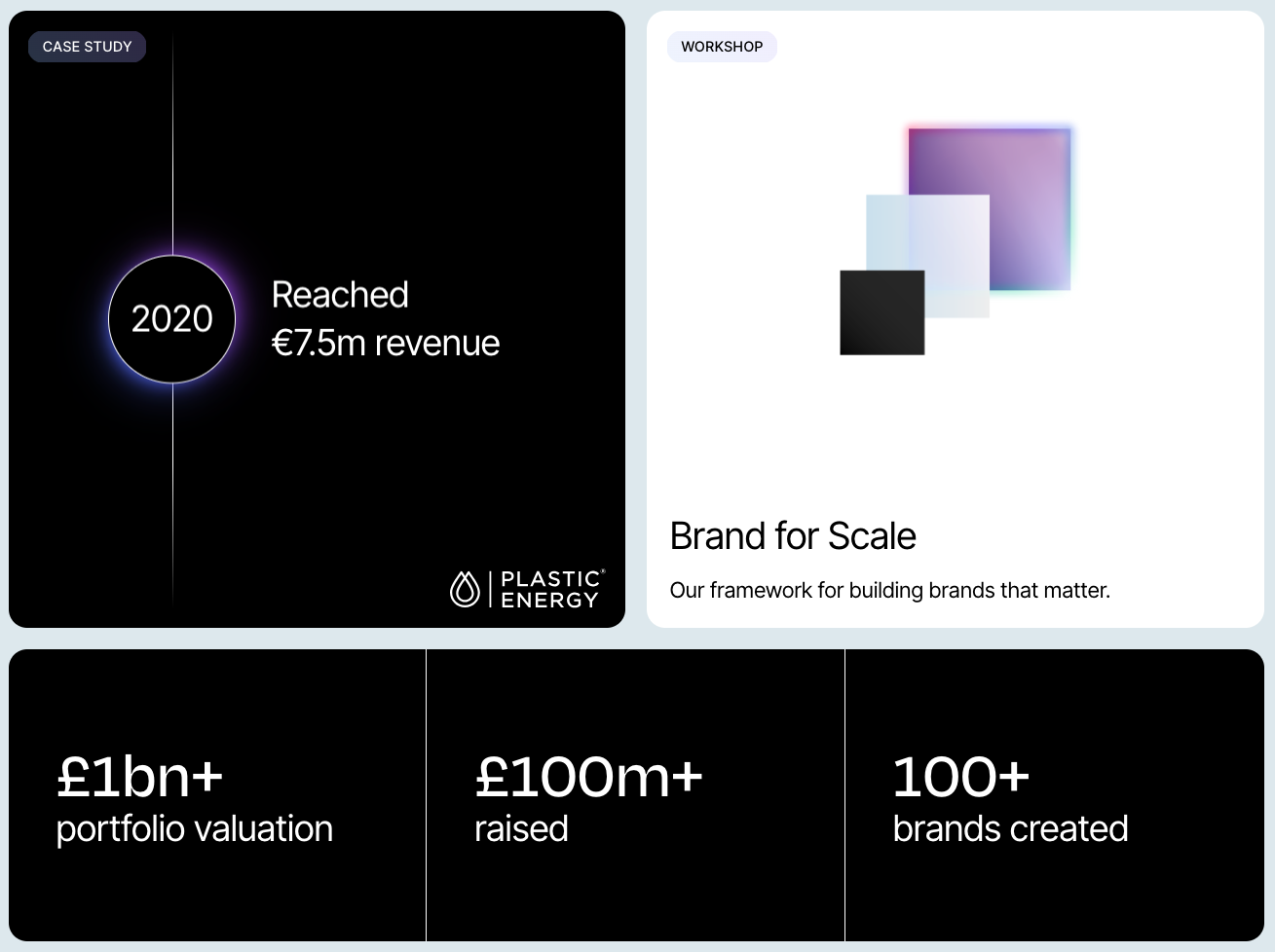
2025
Insurtech product
Sole UX/UI Designer
Click to view case study
2021
D2C App
Sole UX/UI Designer
Click to view case study
2025
Insurtech product
Sole UX/UI Designer
Click to view case study
2025
UX Resource
UX lead
Click to explore
2025
Website
Frontend and UX Lead
Click to explore the website
2025
Website
Frontend and UX Lead
Click to explore the website
2025
Website
UX and Frontend Consultancy
Click to explore the website