As a frustrated user, I set out to design my favourite service the app that it deserves
Role
Sole UX and UI Designer
INDUSTRY
Consumer App
Company
Self initiated


Please use and click around the prototype to the right to explore the final products
I took on his project as a self-initiated
project, assuming all associated roles in the process. My aims
were to improve as a designer, gather research and work with
user data to justify my process. This project helped me
establish how I want to be seen as a designer, the work I wish
to make and the apps I want to use.
This was an exercise
for me to strengthen my portfolio and has no affiliation with
the brand. I don't have access to the company's data, guidelines
or goals that inform their design decisions. I just wanted to
have a little fun and see what I would do with it.
More Yoga is a London-based yoga and fitness studio that offers
access to 33 locations and over 500 weekly classes. To keep
prices low, the studios are unstaffed and the service is
contained digitally. Members use a mobile app to manage their
membership, book classes, view the timetable and contact
customer support. I love the service and use it almost daily,
but I find the app tricky to use and am left unsatisfied by the
level of quality and ease of experience.
By offering only
a class booking service and carrying a dull, corporate UI, the
app is disengaging and lacks a consistent identity. Due to these
factors, I feel that the product may not serve its purpose to
maximise bookings. I saw this as a great opportunity to see how
I could work on a product with existing content and elevate
it.
Please see the diagrams below for a quick
introduction to the app.


Following a typical UX exploration process, each step of my research helped me illuminate the ways I could create the app to fit into the user's world. Following from my interviews and experience mapping, I was able to identify common pain points regularly found by users. This process helped me establish goals in order to directly tackle these issues.


Following a typical UX exploration process, each step of my
research helped me illuminate the ways I could create the app to
fit into the user's world. Following from my interviews and
experience mapping, I was able to identify common pain points
regularly found by users. This process helped me establish goals
in order to directly tackle these issues.
I went on to
make personas, assuming generalisations of the app's intended
users. The personas helped me to better inform my decisions by
considering the circumstances under which users interact with
and benefit from the product. I used these personas to envision
scenarios of how and why users, would engage with the app. This
helped me ideate purposeful features to realistically support my
users while addressing the pain points and goals identified in
my research.
Taking an audit of both existing and
proposed features, I organised all components into pages in
order for them to be found instinctively. I created an
information architecture of how pages would connect with one
another, ensuring that all features are within three clicks from
the homepage.
With a strong idea of where everything is
placed, I sketched out wireframes to check that the skeleton of
the app was steadfast and would achieve my goals. Once I was
pleased with the architecture of the product, I created digital
wireframes, where I could gather a clearer idea of the app as a
whole and how a user would move around it. With plenty
developments in between, I developed a design system and user
interface that supported a bright, exciting brand identity and
eased the pain points identified in my research.


On the original app, users are limited to searching by studio, with a
secondary filter for dates. My interviewees identified the variety
of classes and freedom to use all studios as a major appeal of the
service. The limitations of the search made this appeal redundant.
The users were also frustrated that they couldn't filter by any
categories, such as teacher, ability or class style. The user would
simply have to continue scrolling until they found (or didn't find)
what they were looking for.
I wanted to create the easiest,
most intuitive search. The search default offers smart suggestions
based on classes that the user has taken previously, so they can
instantly book them or browse similar. The filter offers options for
all features, tidied into an accordion to not bombard the user with
options. The filters can be applied separately or in conjunction
with one another to easily refine the user's search.
The current design opens onto the timetable of the member's chosen
studio. My interviewees felt confused and unsatisfied by this. They
continuously reported that didn't understand how to explore outside
of the home screen. I felt this was a missed opportunity to
encourage engagement with the app to increase class
bookings.
Despite the long menu, there weren't originally a
lot of features outside of the timetable. Using personas, ideation,
sketching and scenarios, I created a variety of features that
intended to answer problems faced by the user to keep them engaged.
These features included a friend system, smart suggestions for
classes, introductions to teachers, a support and teacher chat, an
extensive search, news and user statistics.

Most users commented on how dark and uninspiring the original UI was.
My main aim with the user interface was to create a bright, light
and optimistic atmosphere. I worked with the brand's yellow,
creating a fresh colour pallet with a white base and complementary
electric blue to draw attention to CTAs. Regarding colour
psychology, I felt that the optimism, energy and creativity
suggested by the colour pallet was a great brand representative and
popped against the soft elements..
By offering members
methods to explore and engage with the classes, their teachers and
their fellow yoga students, users are drawn in and a more exciting
experience is created. This is designed so that the user's whole
perception of yoga practice is one of enthusiasm and joy. This
feeling encourages a positive brand perception that will encourage
them to continue booking classes.
All users found an issue with opening the menu through a swiping
motion. This felt unintuitive and over a third of my interviewees
eventually gave up on trying. This meant they were limited to
browsing the timetable, and missed out on important features
including the class sign-in and settings. Once the menu was opened,
users felt overwhelmed by an abundance of poorly organised options
that they didn't find immediately relevant. Within the menu were
highly specific, niche settings that would rarely be necessary for
most users.
I completed an audit of the app, organised the
pages and nested them within simple, intuitive categories. These
categories were based upon the main functions of the app, identified
by my users. I created a simple menu, fixed to the bottom and
present throughout the app. On nested pages, a back arrow appears in
the top left hand corner to return to the previous page.
When
organising the pages, I mapped out the information architecture so
that all functions were within three clicks of the home page. This
ensures maximum usability, minimising confusion and frustration for
the user.


Users expressed frustration that they didn't know anything about the
teachers. They would prefer to know a teacher's history and
specialisms before committing to a class.
I created a teacher
profile with an 'ask the teacher' chat feature. This introduces
students to their teachers, ensuring that they can select the right
class for them without wasting time. They are also able to engage
with the teacher to ensure that the class is suitable, breaking down
the barriers that a digital service might not otherwise support.
In response to users being asked to compare the app to other exercise
apps, interviewees commented on a lack of incentive. They reported
that other apps offer features to make users feel competitive and
goal-oriented. This helped them stick to their personal goals, and
feel more inclined to use the app daily.
I decided to add
some personal statistics to the home page. With my personas and
target audience in mind, I kept these soft and playful to stay in
keeping with the brand. The statistics show how many classes you've
taken and what your most visited class is. The design of this page
is highly engaging and is a part of the app that I'd like to extend
upon following further testing.


The Quasimoda typeface is already a part of More
Yoga's visual identity. I decided to use it for the app to keep
brand uniformity. Creating a strong brand was one of my original
goals and I believe that this consistency helps with brand
perception. I'm really happy with this as I find that round,
geometric typefaces convey friendliness, community and
modernity. It's approachable, contemporary and non-intimidating,
which is well in-keeping with the identity I've
built.
After finding that user's didn't feel inspired by
the original app to practice yoga, I wanted the general feel of
the app to be simultaneously playful and calming. The whole UI
is soft, with rounded corners and soft shadows that give a
light, bright and airy feel. I took the original yellow from the
company's branding and used it to accent features. This bright,
pure yellow feels optimistic and creative while the electric
blue complements CTAs with energy and balance. Within cards,
I've used buoyant, abstracted shapes and forms to encourage a
bright, playful atmosphere. All my decisions were based on
creating a cool, contemporary app that made people feel inspired
to practice yoga.


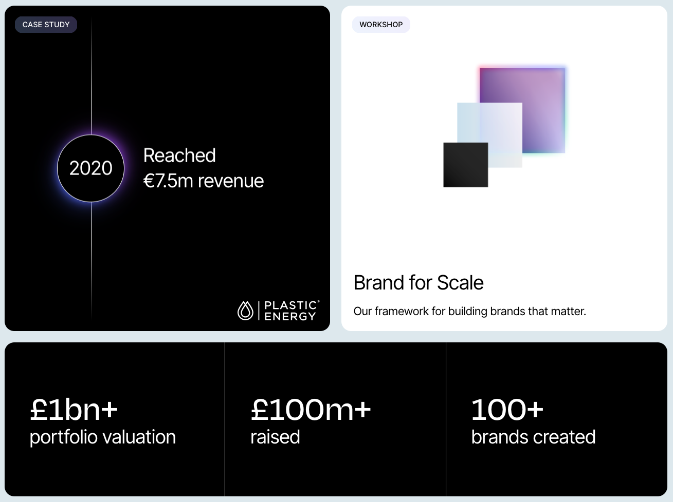
2025
Insurtech product
Sole UX/UI Designer
Click to view case study
2025
Insurtech product
Sole UX/UI Designer
Click to view case study
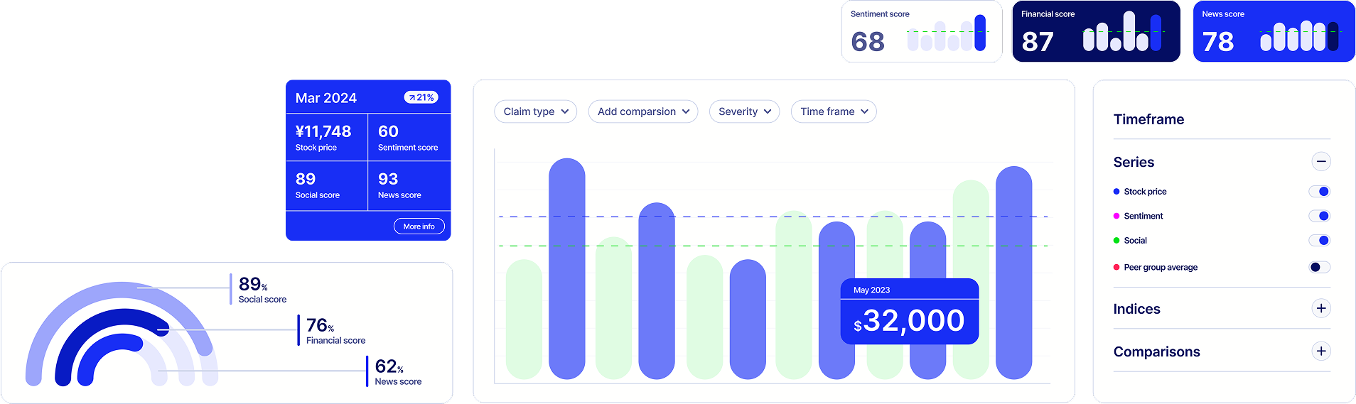
2025
UX Resource
UX lead
Click to explore
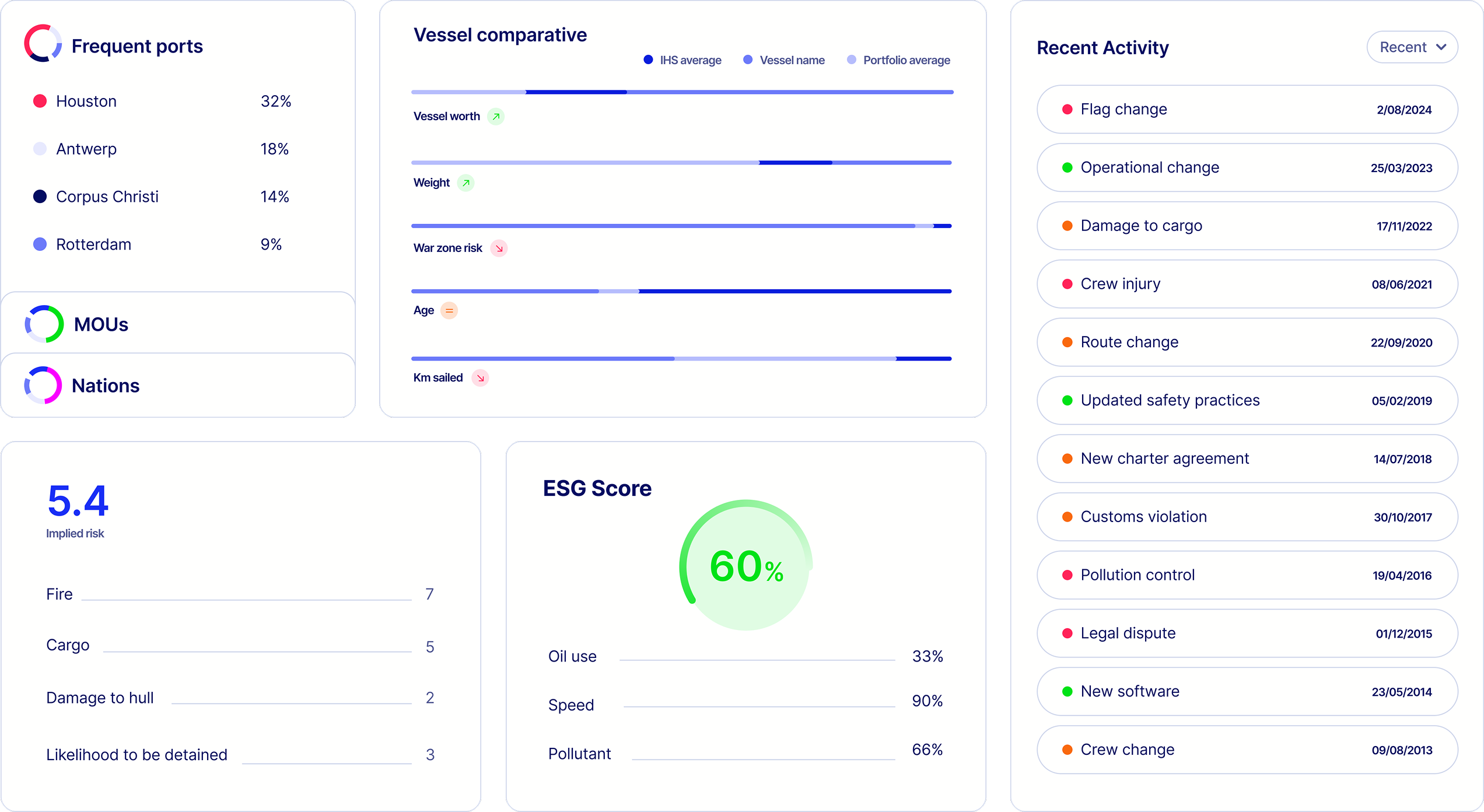
2025
Website
Frontend and UX Lead
Click to explore the website
2025
Website
Frontend and UX Lead
Click to explore the website
2025
Website
UX and Frontend Consultancy
Click to explore the website